Using cartopy and projections for plotting
Contents
Using cartopy and projections for plotting
import s3fs
import xarray as xr
import cartopy.crs as ccrs
import matplotlib.pyplot as plt
Open ERA5 dataset
fs = s3fs.S3FileSystem(anon=True, default_fill_cache=False,
                           config_kwargs = {'max_pool_connections': 20})
files_mapper = [s3fs.S3Map('era5-pds/zarr/2020/06/data/air_temperature_at_2_metres.zarr/', s3=fs)]
%%time
dset = xr.open_mfdataset(files_mapper, engine='zarr',
                            concat_dim='time0', combine='nested',
                            coords='minimal', compat='override', parallel=True)
CPU times: user 312 ms, sys: 14.4 ms, total: 327 ms
Wall time: 5.24 s
Get metadata
dset
<xarray.Dataset>
Dimensions:                      (lat: 721, lon: 1440, time0: 720)
Coordinates:
  * lat                          (lat) float32 90.0 89.75 89.5 ... -89.75 -90.0
  * lon                          (lon) float32 0.0 0.25 0.5 ... 359.5 359.8
  * time0                        (time0) datetime64[ns] 2020-06-01 ... 2020-0...
Data variables:
    air_temperature_at_2_metres  (time0, lat, lon) float32 dask.array<chunksize=(372, 150, 150), meta=np.ndarray>
Attributes:
    institution:  ECMWF
    source:       Reanalysis
    title:        ERA5 forecasts
xarray.Dataset
- lat: 721
- lon: 1440
- time0: 720
- lat(lat)float3290.0 89.75 89.5 ... -89.75 -90.0
- long_name :
- latitude
- standard_name :
- latitude
- units :
- degrees_north
array([ 90. , 89.75, 89.5 , ..., -89.5 , -89.75, -90. ], dtype=float32)
- lon(lon)float320.0 0.25 0.5 ... 359.2 359.5 359.8
- long_name :
- longitude
- standard_name :
- longitude
- units :
- degrees_east
array([0.0000e+00, 2.5000e-01, 5.0000e-01, ..., 3.5925e+02, 3.5950e+02, 3.5975e+02], dtype=float32) - time0(time0)datetime64[ns]2020-06-01 ... 2020-06-30T23:00:00
- standard_name :
- time
array(['2020-06-01T00:00:00.000000000', '2020-06-01T01:00:00.000000000',
       '2020-06-01T02:00:00.000000000', ..., '2020-06-30T21:00:00.000000000',
       '2020-06-30T22:00:00.000000000', '2020-06-30T23:00:00.000000000'],
      dtype='datetime64[ns]')
- air_temperature_at_2_metres(time0, lat, lon)float32dask.array<chunksize=(372, 150, 150), meta=np.ndarray>
- long_name :
- 2 metre temperature
- nameCDM :
- 2_metre_temperature_surface
- nameECMWF :
- 2 metre temperature
- product_type :
- analysis
- shortNameECMWF :
- 2t
- standard_name :
- air_temperature
- units :
- K
Array Chunk Bytes 2.99 GB 33.48 MB Shape (720, 721, 1440) (372, 150, 150) Count 101 Tasks 100 Chunks Type float32 numpy.ndarray
- institution :
- ECMWF
- source :
- Reanalysis
- title :
- ERA5 forecasts
Get variable metadata (air_temperature_at_2_metres)
dset['air_temperature_at_2_metres']
<xarray.DataArray 'air_temperature_at_2_metres' (time0: 720, lat: 721, lon: 1440)>
dask.array<xarray-air_temperature_at_2_metres, shape=(720, 721, 1440), dtype=float32, chunksize=(372, 150, 150), chunktype=numpy.ndarray>
Coordinates:
  * lat      (lat) float32 90.0 89.75 89.5 89.25 ... -89.25 -89.5 -89.75 -90.0
  * lon      (lon) float32 0.0 0.25 0.5 0.75 1.0 ... 359.0 359.2 359.5 359.8
  * time0    (time0) datetime64[ns] 2020-06-01 ... 2020-06-30T23:00:00
Attributes:
    long_name:       2 metre temperature
    nameCDM:         2_metre_temperature_surface
    nameECMWF:       2 metre temperature
    product_type:    analysis
    shortNameECMWF:  2t
    standard_name:   air_temperature
    units:           K
xarray.DataArray
'air_temperature_at_2_metres'
- time0: 720
- lat: 721
- lon: 1440
- dask.array<chunksize=(372, 150, 150), meta=np.ndarray>
Array Chunk Bytes 2.99 GB 33.48 MB Shape (720, 721, 1440) (372, 150, 150) Count 101 Tasks 100 Chunks Type float32 numpy.ndarray - lat(lat)float3290.0 89.75 89.5 ... -89.75 -90.0
- long_name :
- latitude
- standard_name :
- latitude
- units :
- degrees_north
array([ 90. , 89.75, 89.5 , ..., -89.5 , -89.75, -90. ], dtype=float32)
- lon(lon)float320.0 0.25 0.5 ... 359.2 359.5 359.8
- long_name :
- longitude
- standard_name :
- longitude
- units :
- degrees_east
array([0.0000e+00, 2.5000e-01, 5.0000e-01, ..., 3.5925e+02, 3.5950e+02, 3.5975e+02], dtype=float32) - time0(time0)datetime64[ns]2020-06-01 ... 2020-06-30T23:00:00
- standard_name :
- time
array(['2020-06-01T00:00:00.000000000', '2020-06-01T01:00:00.000000000',
       '2020-06-01T02:00:00.000000000', ..., '2020-06-30T21:00:00.000000000',
       '2020-06-30T22:00:00.000000000', '2020-06-30T23:00:00.000000000'],
      dtype='datetime64[ns]')
- long_name :
- 2 metre temperature
- nameCDM :
- 2_metre_temperature_surface
- nameECMWF :
- 2 metre temperature
- product_type :
- analysis
- shortNameECMWF :
- 2t
- standard_name :
- air_temperature
- units :
- K
Select time
Check time format when selecting a specific time
dset['air_temperature_at_2_metres'].sel(time0='2020-06-30T21:00:00.000000000')
<xarray.DataArray 'air_temperature_at_2_metres' (lat: 721, lon: 1440)>
dask.array<getitem, shape=(721, 1440), dtype=float32, chunksize=(150, 150), chunktype=numpy.ndarray>
Coordinates:
  * lat      (lat) float32 90.0 89.75 89.5 89.25 ... -89.25 -89.5 -89.75 -90.0
  * lon      (lon) float32 0.0 0.25 0.5 0.75 1.0 ... 359.0 359.2 359.5 359.8
    time0    datetime64[ns] 2020-06-30T21:00:00
Attributes:
    long_name:       2 metre temperature
    nameCDM:         2_metre_temperature_surface
    nameECMWF:       2 metre temperature
    product_type:    analysis
    shortNameECMWF:  2t
    standard_name:   air_temperature
    units:           K
xarray.DataArray
'air_temperature_at_2_metres'
- lat: 721
- lon: 1440
- dask.array<chunksize=(150, 150), meta=np.ndarray>
Array Chunk Bytes 4.15 MB 90.00 kB Shape (721, 1440) (150, 150) Count 151 Tasks 50 Chunks Type float32 numpy.ndarray - lat(lat)float3290.0 89.75 89.5 ... -89.75 -90.0
- long_name :
- latitude
- standard_name :
- latitude
- units :
- degrees_north
array([ 90. , 89.75, 89.5 , ..., -89.5 , -89.75, -90. ], dtype=float32)
- lon(lon)float320.0 0.25 0.5 ... 359.2 359.5 359.8
- long_name :
- longitude
- standard_name :
- longitude
- units :
- degrees_east
array([0.0000e+00, 2.5000e-01, 5.0000e-01, ..., 3.5925e+02, 3.5950e+02, 3.5975e+02], dtype=float32) - time0()datetime64[ns]2020-06-30T21:00:00
- standard_name :
- time
array('2020-06-30T21:00:00.000000000', dtype='datetime64[ns]')
- long_name :
- 2 metre temperature
- nameCDM :
- 2_metre_temperature_surface
- nameECMWF :
- 2 metre temperature
- product_type :
- analysis
- shortNameECMWF :
- 2t
- standard_name :
- air_temperature
- units :
- K
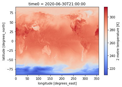
Visualize data
Simple visualization from xarray plotting method
%%time
dset['air_temperature_at_2_metres'].sel(time0='2020-06-30T21:00').plot(cmap = 'coolwarm')
CPU times: user 6.52 s, sys: 1.34 s, total: 7.86 s
Wall time: 1min 17s
<matplotlib.collections.QuadMesh at 0x7f17e9b70190>
Save intermediate results to local disk
We usually need a lot of customization when plotting so before plotting, make sure to save intermediate results to disk to speed-up your work
%%time
dset['air_temperature_at_2_metres'].sel(time0='2020-06-30T21:00').to_netcdf("ERA5_air_temperature_at_2_metres_2020-06-30T2100.nc")
Save netCDF file into your current galaxy history
This approach is only valid for small datafiles, typically those you will save before plotting
This can be helpful for sharing dataset with your colleagues or if you have to restart your JupyterLab instance
!put -p ERA5_air_temperature_at_2_metres_2020-06-30T2100.nc -t netcdf
Open local file before plotting
dset = xr.open_dataset("ERA5_air_temperature_at_2_metres_2020-06-30T2100.nc")
Same plot but with local file
%%time
dset['air_temperature_at_2_metres'].plot(cmap = 'coolwarm')
CPU times: user 212 ms, sys: 7.64 ms, total: 219 ms
Wall time: 287 ms
<matplotlib.collections.QuadMesh at 0x7f17e3edb610>

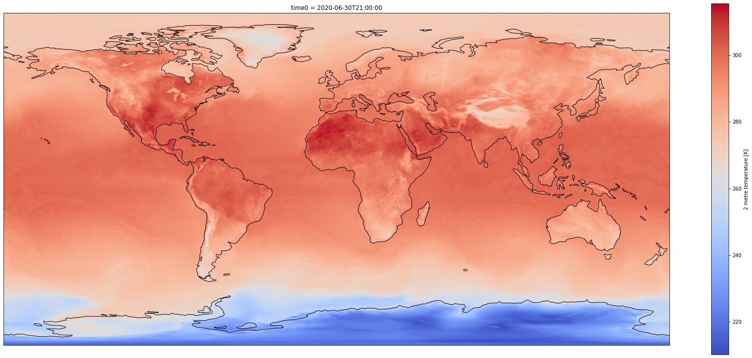
Customize plot
Set the size of the figure and add coastlines
%%time
fig = plt.figure(1, figsize=[30,13])

# Set the projection to use for plotting
ax = plt.subplot(1, 1, 1, projection=ccrs.PlateCarree())
ax.coastlines()

# Pass ax as an argument when plotting. Here we assume data is in the same coordinate reference system than the projection chosen for plotting
# isel allows to select by indices instead of the time values
dset['air_temperature_at_2_metres'].plot.pcolormesh(ax=ax, cmap='coolwarm')
CPU times: user 7.68 s, sys: 38 ms, total: 7.72 s
Wall time: 8.15 s
<matplotlib.collections.QuadMesh at 0x7f17e3eb1fd0>
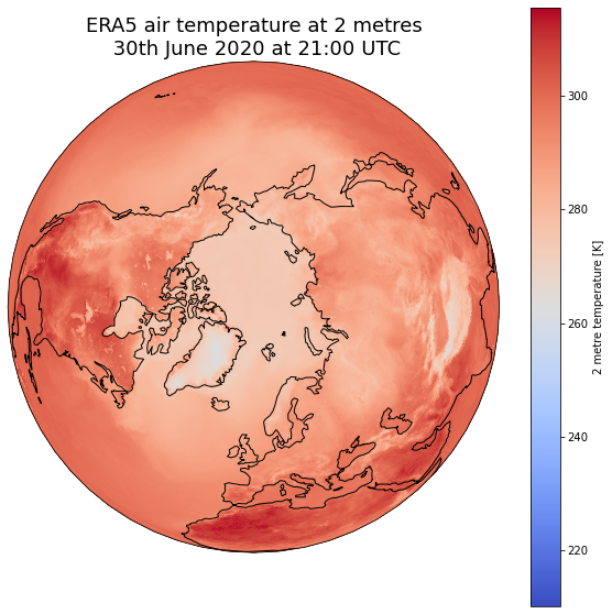
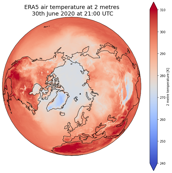
Change plotting projection
%%time

fig = plt.figure(1, figsize=[10,10])

# We're using cartopy and are plotting in Orthographic projection
# (see documentation on cartopy)
ax = plt.subplot(1, 1, 1, projection=ccrs.Orthographic(0, 90))
ax.coastlines()

# We need to project our data to the new Orthographic projection and for this we use `transform`.
# we set the original data projection in transform (here PlateCarree)
dset['air_temperature_at_2_metres'].plot(ax=ax, transform=ccrs.PlateCarree(), cmap='coolwarm')

# One way to customize your title
plt.title("ERA5 air temperature at 2 metres\n 30th June 2020 at 21:00 UTC", fontsize=18)
CPU times: user 499 ms, sys: 10.6 ms, total: 509 ms
Wall time: 592 ms
Text(0.5, 1.0, 'ERA5 air temperature at 2 metres\n 30th June 2020 at 21:00 UTC')
Choose extent of values
%%time
fig = plt.figure(1, figsize=[10,10])

ax = plt.subplot(1, 1, 1, projection=ccrs.Orthographic(0, 90))
ax.coastlines()

# Fix extent
minval = 240
maxval = 310

# pass extent with vmin and vmax parameters
dset['air_temperature_at_2_metres'].plot(ax=ax, vmin=minval, vmax=maxval, transform=ccrs.PlateCarree(), cmap='coolwarm')

# One way to customize your title
plt.title("ERA5 air temperature at 2 metres\n 30th June 2020 at 21:00 UTC", fontsize=18)
CPU times: user 464 ms, sys: 4.72 ms, total: 469 ms
Wall time: 514 ms
Text(0.5, 1.0, 'ERA5 air temperature at 2 metres\n 30th June 2020 at 21:00 UTC')
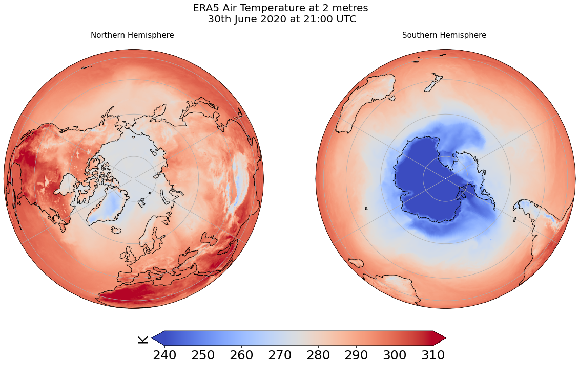
Combine plots with different projections
%%time
fig = plt.figure(1, figsize=[20,10])

# Fix extent
minval = 240
maxval = 310

# Plot 1 for Northern Hemisphere subplot argument (nrows, ncols, nplot)
# here 1 row, 2 columns and 1st plot
ax1 = plt.subplot(1, 2, 1, projection=ccrs.Orthographic(0, 90))

# Plot 2 for Southern Hemisphere
# 2nd plot
ax2 = plt.subplot(1, 2, 2, projection=ccrs.Orthographic(180, -90))

tsel = 0
for ax,t in zip([ax1, ax2], ["Northern", "Southern"]):
    map = dset['air_temperature_at_2_metres'].plot(ax=ax, vmin=minval, vmax=maxval,
                                           transform=ccrs.PlateCarree(),
                                           cmap='coolwarm',
                                           add_colorbar=False)
    ax.set_title(t + " Hemisphere \n" , fontsize=15)
    ax.coastlines()
    ax.gridlines()

# Title for both plots
fig.suptitle('ERA5 Air Temperature at 2 metres\n 30th June 2020 at 21:00 UTC', fontsize=20)


cb_ax = fig.add_axes([0.325, 0.05, 0.4, 0.04])

cbar = plt.colorbar(map, cax=cb_ax, extend='both', orientation='horizontal', fraction=0.046, pad=0.04)
cbar.ax.tick_params(labelsize=25)
cbar.ax.set_ylabel('K', fontsize=25)
CPU times: user 939 ms, sys: 12.9 ms, total: 952 ms
Wall time: 1.26 s
Text(0, 0.5, 'K')