Running your experiments and analyzing your results
Overview
Teaching: 0 min
Exercises: 0 minQuestions
How to submit your short run?
How to continue your run
Objectives
Be able to do a quick run to test an experiment
If successful resubmit the same experiment for a longer period
Analyze the outputs from your experiment
Prepare graphs using python
Running your experiment
Now you are ready to submit your simulation on Saga.
On Saga:cd $HOME/cases/F2000climo-f19_g17.$EXPNAME
./case.submit
To monitor your job:
squeue -u $USER
         JOBID       PARTITION  NAME      USER      ST     TIME       NODES NODELIST(REASON)
         26243157    normal     F2000cl  bjorngli  R      18:25      7     c14-[3,6,10,13-14],c16-[8,22]
If you realize after having submitted your job that you forgot something (so that it is not worth wasting CPU time) you can always delete your job using the JOBID obtained with the previous squeue -u $USER command (in this example 26243157).
scancel 26243157
If your simulation is unsuccessful you have to understand what happened!
There are in particular log files in the run directory (/cluster/work/users/$USER/cesm/F2000climo-f19_g17.$EXPNAME/run/) which can provide some clues, although the error messages are not always explicit…
Open the latest log file with your favorit text editor (vi, emacs, etc.) and try to search for keywords like “ERROR” or “Error” or “error” (remember that the search is case sensitive).
Then correct any identified bug.
If your short simulation has finished without crashing, check the outputs: were your changes taken into account? Do you get significant results?
Model timing data
A summary timing output file is produced after every CESM run. On Saga and in our case this file is placed in /cluster/work/users/$USER/archive/F2000climo-f19_g17.$EXPNAME/logs and is nammed cpl.log.$date.gz (where $date is a datestamp set by CESM at runtime).
This file contains information which is useful for load balancing a case (i.e., to optimize the processor layout for a given model configuration, compset, grid, etc. such that the cost and throughput will be optimal).
For this lesson we will concentrate on the last few lines in the file and in particular the number of simulated years per computational day, which will help us evaluate the wallclock time required for long runs.
On Saga:vi cpl.log.190205-144355.gz
.......................
(seq_mct_drv): =============== SUCCESSFUL TERMINATION OF CPL7-CCSM ===============
(seq_mct_drv): =============== at YMD,TOD = 90201 0 ===============
(seq_mct_drv): =============== # simulated days (this run) = 31.000 ===============
(seq_mct_drv): =============== compute time (hrs) = 0.347 ===============
(seq_mct_drv): =============== # simulated years / cmp-day = 5.873 ===============
(seq_mct_drv): =============== pes min memory highwater (MB) 50.429 ===============
(seq_mct_drv): =============== pes max memory highwater (MB) 517.162 ===============
(seq_mct_drv): =============== pes min memory last usage (MB) -0.001 ===============
(seq_mct_drv): =============== pes max memory last usage (MB) -0.001 ===============
Here the throughput was 5.873 simulated years / cmp-day and it took 0.347 * 60 ~ 21 minutes to run the first month. Assuming that the other months will take approximately the same time, that represents about 3 months per hour and a bit more than 4 hours for 12 months.
Long experiment (14 months)
As for the previous exercice, you will work in pairs for this practical and you will analyze the model outputs in pairs.
You will be using your previous experiment $HOME/cases/F2000climo-f19_g17.$EXPNAME (EXPNAME should be set depending on your experiment!) and run 14 months.
Set a new duration for your experiment
Make sure you set the duration of your experiment properly. Here we wish to run 14 months from the control restart experiment but as it is a long run, we would rather continue to split it into chuncks of 1 month.
Note that splitting an experiment into small chunks is good practice: this way if something happens and the experiment crashes (disk quota exceeded, hardware issue, etc.) everything will not be lost and it will be possible to resume the run from the latest set of restart files.
On Saga:# Set EXPNAME properly
cd $HOME/cases/F2000climo-f19_g17.$EXPNAME
Since we have already the first month done, we are going to continue the experiment instead of starting from scratch.
On Saga:./xmlchange CONTINUE_RUN=TRUE
To perform a 14 months experiment, we would need to repeat this one month experiment 13 times.
For this purpose there is a CESM option called RESUBMIT.
On Saga:./xmlchange RESUBMIT=13
By setting this option, CAM6 will be running one month of simulation (once submitted) and automatically resubmit the next 12 months.
On Saga:cd $HOME/cases/F2000climo-f19_g17.$EXPNAME
./case.submit
updating WALLCLOCK TIME
Remember that you can update the job wallclock time:
./xmlchange --subgroup case.run JOB_WALLCLOCK_TIME=01:00:00Make sure you set the job wallclock time before submitting your case (
./case.submit)
Regularly check your experiment (and any generated output files) and once it is fully done, store your model outputs on NIRD.
Store model outputs on NIRD
First make sure that your run was successful and check all the necessary output files were generated.
To post-process and visualize your model outputs, it is VERY IMPORTANT you move them from Saga to NIRD. Remember that all model outputs are generated in a semi-temporary directory and all your files will be removed after a few weeks!
If you haven’t set-up your SSH keys, the next commands (ssh and rsync) will require you to enter your Unix password.
Make sure you define EXPNAME properly (it depends on your experiment).
On Saga:# If you are running CO2 experiment (otherwise adjust: sea_ice, SST, rocky)
export EXPNAME=CO2
Then copy the archived files from Saga to the NIRD project area.
It is sometimes sensible to also copy the run files and even the case directory, but that should not be necessary for this lesson.
On Saga:ssh login.nird.sigma2.no 'mkdir -p /projects/NS1000K/climate/GEO4962/outputs/$USER/archive'
rsync -avz /cluster/work/users/$USER/archive/F2000climo-f19_g17.$EXPNAME $USER@login.nird.sigma2.no:/projects/NS1000K/climate/GEO4962/outputs/$USER/archive/.
Once the previous commands are successful, you are ready to post-process and visualize your data on http://climate.uiogeo-apps.sigma2.no/.
However, as your simulation is stored on the NIRD project area, you can now archive your experiment on the NIRD archive (long-term archive i.e. several years).
Post processing and visualization
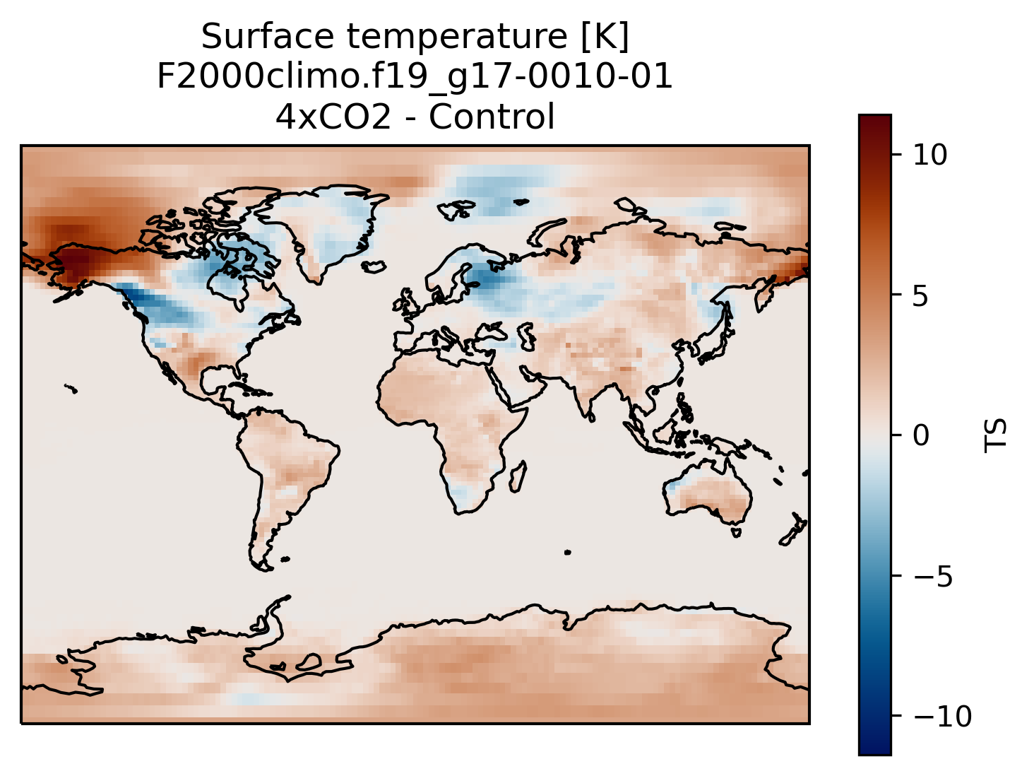
You can always compare the results of your experiments to the control run, at any time (i.e., this applies for both the short and long runs).
An easy way to do this is to calculate the difference between for example the surface temperature field issued from the control run and that from your new experiment.
Visualization with xarray
On jupyterhub:Start a new pangeo notebook on your JupyterHub (in this example we assume we have the first month of data from the 4xCO2 experiment).
import os
import xarray as xr
import cartopy.crs as ccrs
import matplotlib.pyplot as plt
%matplotlib inline

experiment = 'F2000climo.f19_g17'
month = '0010-01'
username = # your username on NIRD here

path = 'shared-ns1000k/GEO4962/outputs/runs/F2000climo.f19_g17.control/atm/hist/'
filename = path + 'F2000climo.f19_g17.control.cam.h0.' + month + '.nc'
dsc = xr.open_dataset(filename, decode_cf=False)
TSc = dsc['TS'][0] # the [0] is necessary because the two datasets have different time indices

path = 'shared-ns1000k/GEO4962/outputs/' + username + '/archive/F2000climo.f19_g17.CO2/atm/hist/'
filename = path + 'F2000climo.f19_g17.CO2.cam.h0.' + month + '.nc'
dsco2 = xr.open_dataset(filename, decode_cf=False)
TSco2 = dsco2['TS'][0]

diff = TSco2 - TSc

fig = plt.figure()
ax = plt.axes(projection=ccrs.Miller())

diff.plot(ax=ax,
           transform=ccrs.PlateCarree(),
           cmap=load_cmap('vik')
           )

ax.coastlines()
plt.title('Surface temperature [K]\n' + experiment + '-' + month + '\n4xCO2 - Control')
Making bespoke graphs with python
Let’s make a basic contour plot with python.
On jupyterLab:Now we can make a contour plot with a single command.
On jupyter:TSco2.plot.contourf()
to obtain this:
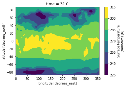
This figure is not very useful: we do not know which projection was used, there is no coastline, we would rather have a proper title, etc.
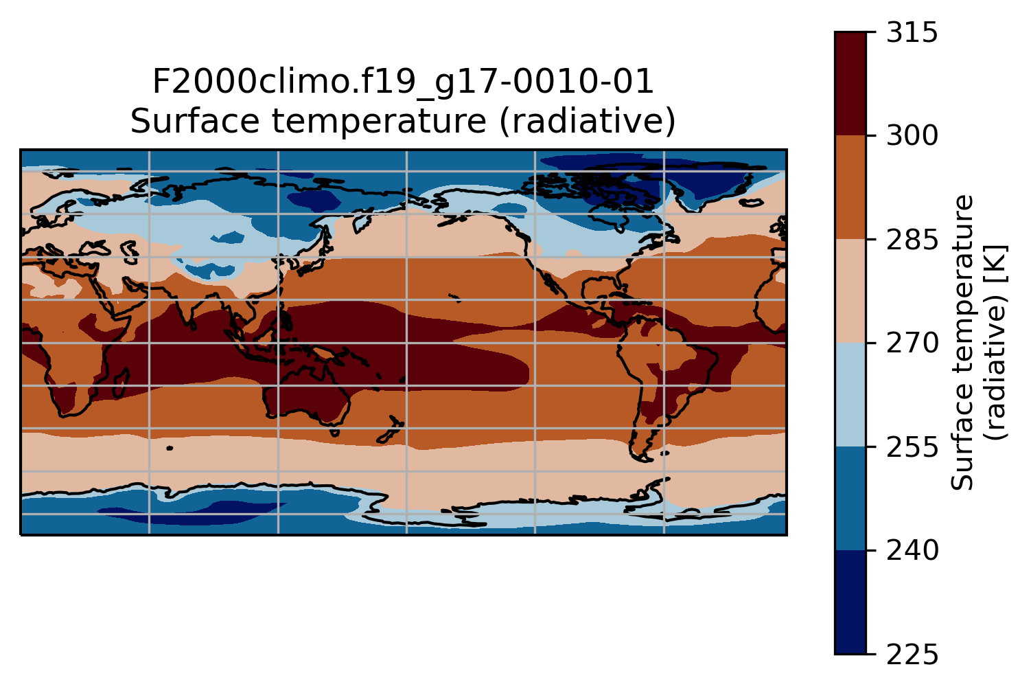
To do that we need to add bit more information.
On jupyter:import matplotlib.pyplot as plt
import cartopy.crs as ccrs
ax = plt.axes(projection=ccrs.PlateCarree(central_longitude=180))
TSco2.plot.contourf(ax=ax,
transform=ccrs.PlateCarree())
ax.set_title(experiment + '-' + month + '\n' + TSco2.long_name)
ax.coastlines()
ax.gridlines()
This is a slightly better plot …
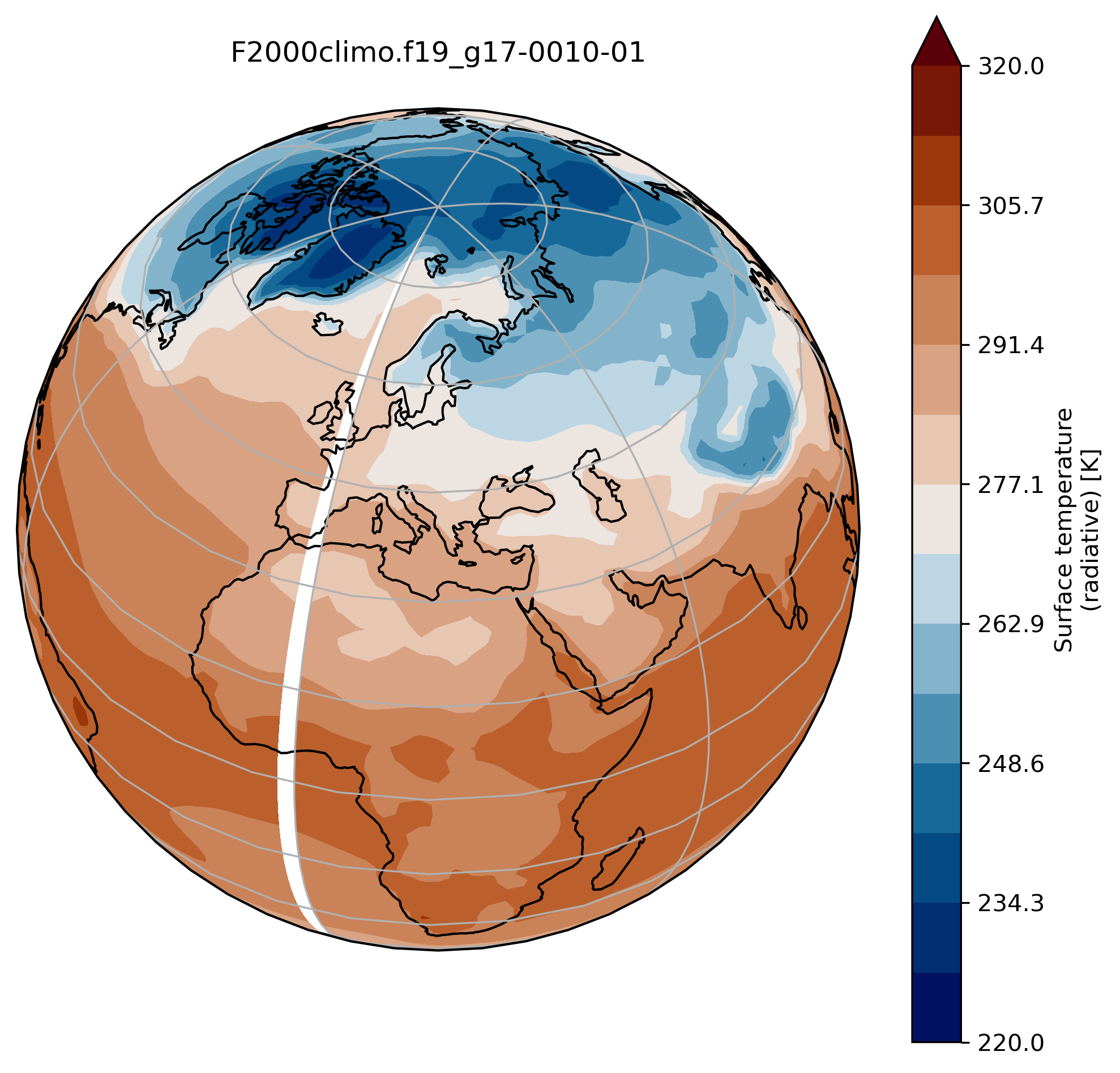
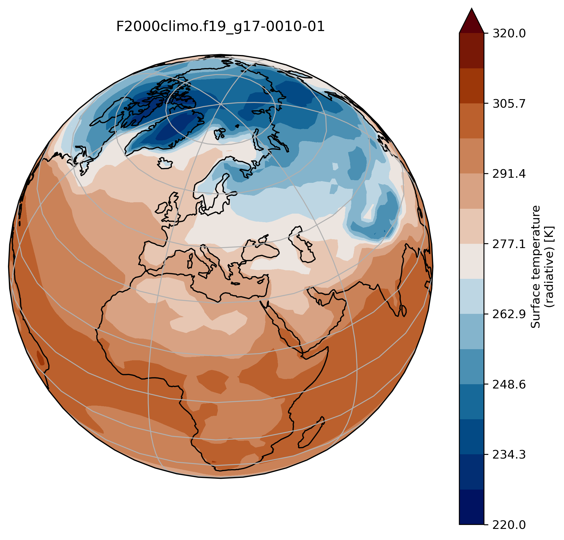
Change the default projection
It is very often convenient to visualize using a different projection than the original data:
On jupyter:TSmin = 220
TSmax = 320
fig = plt.figure(figsize=[8, 8])
ax = fig.add_subplot(1, 1, 1,
projection=ccrs.Orthographic(central_longitude=20, central_latitude=40))
TSco2.plot.contourf(ax=ax,
transform=ccrs.PlateCarree(),
extend='max',
cmap=load_cmap('vik'),
levels=15,
vmin=TSmin, vmax = TSmax)
ax.set_title(experiment + '-' + month + '\n')
ax.coastlines()
ax.gridlines()
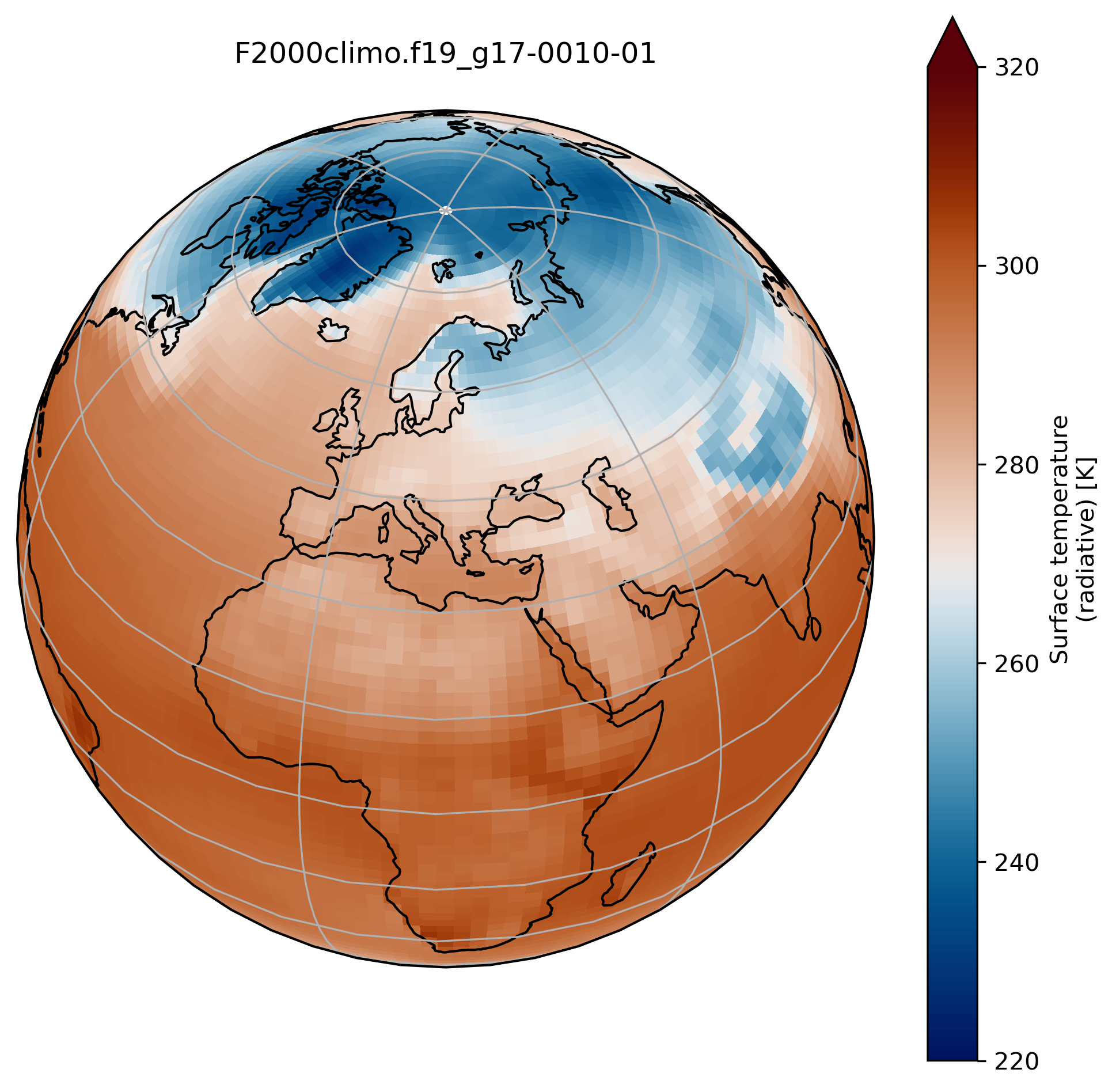
wrap around longitudes
On jupyter:# what is longitude min and max? print(TSco2.lon.min(), TSco2.lon.max())To fill the gap, we can wrap around longitudes i.e. add a new longitude band at 360. equals to 0.
from cartopy.util import add_cyclic_point

TSmin = 220
TSmax = 320

# max longitude is 357.5 so we add another longitude 360. (= 0.)
TS_cyclic_co2, lon_cyclic = add_cyclic_point(TSco2.values, coord=TSco2.lon)
# Create a new xarray with the new arrays
TSco2_cy = xr.DataArray(TS_cyclic_co2, coords={'lat':TSco2.lat, 'lon':lon_cyclic}, dims=('lat','lon'),
                       attrs = TSco2.attrs )

fig = plt.figure(figsize=[8, 8])
ax = fig.add_subplot(1, 1, 1,
                     projection=ccrs.Orthographic(central_longitude=20, central_latitude=40))

TSco2_cy.plot.contourf(ax=ax,
                      transform=ccrs.PlateCarree(),
                      extend='max',
                      cmap=load_cmap('vik'),
                      levels=15,
                      vmin=TSmin, vmax = TSmax)

ax.set_title(experiment + '-' + month + '\n')
ax.coastlines()
ax.gridlines()
You can now use the command savefig to save the current figure into a file.
On jupyter:fig.savefig(experiment + '-' + month + '.png')
contourf versus pcolormesh
So far, we used contourf to visualize our data but we can also use pcolormesh.
Change contourf by pcolormesh
Change contourf by pcolormesh in the previous plot.
What do you observe?
Solution
import os
import xarray as xr
import numpy as np
import cartopy.crs as ccrs
from cartopy.util import add_cyclic_point
import matplotlib.pyplot as plt

%matplotlib inline


experiment = 'F2000climo.f19_g17'
month = '0010-01'
username = 'herfugl' # you NIRD username here

path = 'shared-ns1000k/GEO4962/outputs/' + username + '/archive/F2000climo.f19_g17.CO2/atm/hist/'
filename = path + 'F2000climo.f19_g17.CO2.cam.h0.' + month + '.nc'

dsco2 = xr.open_dataset(filename, decode_cf=False)
TSco2 = dsco2['TS'][0]

TSmin = 220
TSmax = 320

# max longitude is 356.25 so we add another longitude 360. (= 0.)
TS_cyclic_co2, lon_cyclic = add_cyclic_point(TSco2.values, coord=TSco2.lon)
# Create a new xarray with the new arrays
TSco2_cy = xr.DataArray(TS_cyclic_co2, coords={'lat':TSco2.lat, 'lon':lon_cyclic}, dims=('lat','lon'),
                       attrs = TSco2.attrs )

fig = plt.figure(figsize=[8, 8])
ax = fig.add_subplot(1, 1, 1,
                     projection=ccrs.Orthographic(central_longitude=20, central_latitude=40))

TSco2_cy.plot.pcolormesh(ax=ax,
                      transform=ccrs.PlateCarree(),
                      extend='max',
                      cmap=load_cmap('vik'),
                      vmin=TSmin, vmax = TSmax)

ax.set_title(experiment + '-' + month + '\n')
ax.coastlines()
ax.gridlines()
Create multiple plots in the same figure
See here.
On jupyter:import os
import xarray as xr
import numpy as np
import cartopy.crs as ccrs
from cartopy.util import add_cyclic_point
import matplotlib.pyplot as plt
%matplotlib inline
experiment = 'F2000climo.f19_g17'
username = # your NIRD username here
path = 'shared-ns1000k/GEO4962/outputs/' + username + '/archive/F2000climo.f19_g17.CO2/atm/hist/'
fig = plt.figure(figsize=[20, 8])
TSmin = 220
TSmax = 320
for month in range(1,4):
filename = path + 'F2000climo.f19_g17.CO2.cam.h0.0010-0' + str(month) + '.nc'
dset = xr.open_dataset(filename, decode_cf=False)
TSco2 = dset['TS'][0]
lat = dset['lat']
lon = dset['lon']
dset.close()
TS_cyclic_si, lon_cyclic = add_cyclic_point(TSco2.values, coord=TSco2.lon)
TSco2_cy = xr.DataArray(TS_cyclic_si, coords={'lat':TSco2.lat, 'lon':lon_cyclic}, dims=('lat','lon'),
attrs = TSco2.attrs )
ax = fig.add_subplot(1, 3, month, projection=ccrs.Mollweide()) # specify (nrows, ncols, axnum)
cs = TSco2_cy.plot.contourf(ax=ax,
transform=ccrs.PlateCarree(),
extend='max',
cmap=load_cmap('vik'),
vmin=TSmin, vmax = TSmax,
levels=15,
add_colorbar=False)
ax.set_title( 'month ' + str(month) + '\n')
ax.coastlines()
ax.gridlines()
fig.suptitle(experiment + '-0010'+'\n' + TSco2.long_name, fontsize=24)
# adjust subplots so we keep a bit of space on the right for the colorbar
fig.subplots_adjust(right=0.8)
# Specify where to place the colorbar
cbar_ax = fig.add_axes([0.12, 0.28, 0.72, 0.03])
# Add a unique colorbar to the figure
fig.colorbar(cs, cax=cbar_ax, label=TSco2.units,
orientation='horizontal')
Key Points
Start an experiment from a spinup
Continue an existing experiment
Evaluate the CPU time required for a long run
Make custom plots